Microsoft Excel 2016 Level 3.5: Creating Sparklines and Mapping Data

- Product ID
- sonie16cs_vod
- Training Time ?
- 9 to 14 minutes
- Language(s)
- English
- Video Format
- High Definition
- Required Plugins
- None
- Number of Lessons
- 2
- Quiz Questions
- 5
- Closed Captioning
- Question Feedback
- Wrong Answer Remediation
- Lesson Bookmarking
- Downloadable Resources

Microsoft Excel 2016 Level 3.5: Creating Sparklines and Mapping Data
The amount of data one can accumulate in an Excel workbook can be immense. Excel 2016 includes tools to help users create more visually appealing presentations of their data. This online training demonstrates how to create Sparklines and Map Data in Microsoft Excel 2016.
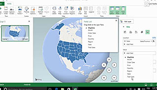
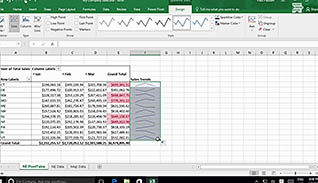
A Sparkline allows a user to provide a quick snapshot of data visually in a single cell. This training video shows examples of how to use Microsoft Excel 2016 Sparklines to present data. This video also explores the power of Mapping data. Excel 2016 allows users to create maps to display geographic data, and this course provides the step-by-step directions to get started.
Microsoft Excel 2016 Sparklines and Mapping Data are useful tools for presenting data. Use this course to become a more proficient Excel 2016 user and create representations of your data everyone can quickly understand and analyze.
![]() This course is in the Video On Demand format, to read about Video On Demand features click here.
This course is in the Video On Demand format, to read about Video On Demand features click here.

- Install on any SCORM LMS
- Full-screen video presentation
- Print certificate and wallet card
- You have 30 days to complete the course

Excel 2016 users
- Create Sparklines
- Map Data
-
Create sparklines.
- Select a sparkline that will display data trends.
- Select a sparkline that will display a relative value.
- Recall different contextual tools to easily interpret data.
-
Map data.
- Recall where the 3D Map feature is located.
- Identify features available with 3D mapping.
© Mastery Technologies, Inc.
